In short
Logos and graphics — a standalone engagement, usually 2–3 weeks.
Website and application design — delivered together with the build, not handed over as mockups alone.
Design to MVP in 2 weeks, final version in 3–5 weeks.
Design decisions come from talking to you and from established practice — we do not sell research we do not run.
The design system is built for the project and lands in code as components, rather than staying in Figma.
Two kinds of engagement
Identity: logo and graphics
A standalone service. You do not need to build anything with us — we design logos, graphic assets and identity elements as their own engagement.
Product design: UX and UI
Website and application design is delivered as part of the build. The same team designs and builds, so what you approve in the mockup is what ends up in code.
Logo and visual identity
This is the one part of our design work we sell completely separately — there is no need to build a site or an application with us.
We design logos, variants for different uses, and the graphic assets around them. We start with a conversation about what the company does and who it speaks to, because a mark that does not follow from the brand's positioning is just a nice picture.
A logo typically takes 2–3 weeks, including revision rounds.
Redesigning an existing logo and refreshing graphic assets is also available as a standalone engagement.
Boosting design efficiency with AI
AI design tools boost efficiency by automating tasks and enhancing creativity. At Netguru, we endorse top tools like Perplexity, Tellet, ChatGPT.
UX and UI design for digital products
Website and application design is delivered as part of a build we run ourselves. We do not hand mockups over for somebody else to implement — a deliberate decision rather than a limitation.
UX — screen layout, user paths, and what happens in the situations nobody usually asks about: on a validation error, on an empty state, with text longer than the design assumed, on a narrow screen. Those cases decide whether the product works in practice.
UI — the visual layer: typography, colour, components and responsiveness. Designed so it can be built exactly as it looks.
Design system — built for a specific software project and used as the single source of truth for the team. With us it does not end as a Figma file; it lands in code as components.
How long it takes
Real timelines from our projects.
The process
The same sequence for a website and an application — the scale changes, the order does not.
Workshop
We talk about what the product should achieve, who uses it, and which paths matter most commercially.
Wireframes
Screen layout and flows, still without the visual layer. Changes are cheapest here, and this is where the important decisions usually get made.
Prototype
A clickable version you can walk through as if it were finished. It catches problems a static screen hides.
Design system
Components, typography, colours and states — written down once so the rest of the product stays consistent without asking about every detail.
Hand-off to the build
The design goes to the same team that will build it. No stage where intent is translated between companies.
What our design decisions are based on
We will say this plainly, because the question comes up on the first call anyway: we do not run user research or usability testing. We do not sell a service we do not perform.
Our decisions rest on two things: the conversation with you — you are the ones who know your customers, their questions and the places where they get stuck — and established interface design practice, tested on thousands of products before it reached our desk.
For most projects that is enough and it is the right cost-to-effect ratio. If your product is unusual enough, or the stakes high enough, that quantitative research or usability testing is genuinely needed, we will say so and point you to where to find it. That is a separate budget and a separate competence.
Design and build in one team
In the usual arrangement an agency hands over mockups and developers reproduce them. They reproduce them with deviations, because nobody asked how a component behaves on a validation error, with an empty list, or with a name longer than the design assumed. The design system lives in Figma and drifts from the code after the first sprint.
With us the design goes to the team that builds it — same stack, same company. The design system is not a document, it is components in React. What you approved in the mockup is what you get in production.
That is why we do not sell product design without the build. We would rather not hand over mockups whose fate we do not control.
Scope of work
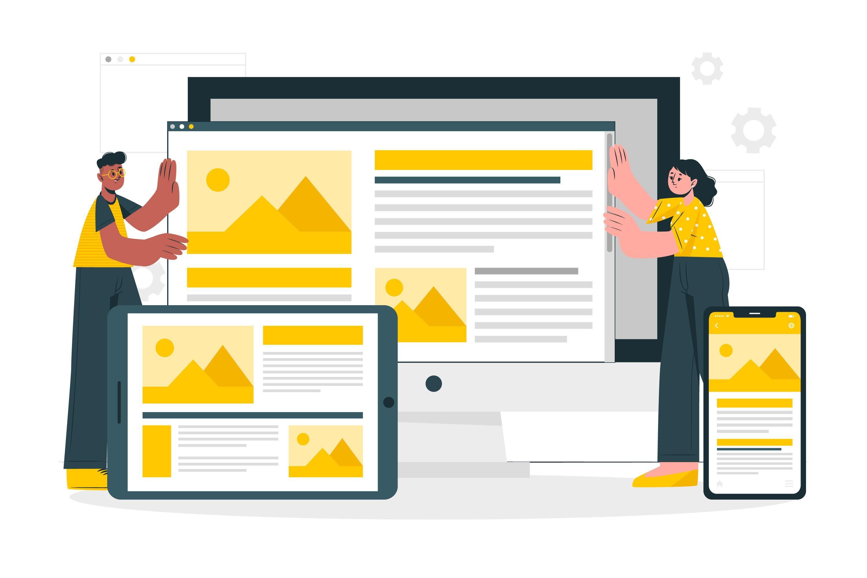
Logo and identity
The mark, its variants and graphic assets. A standalone engagement, with no build required.
UX design
Screen layout, user paths and the edge cases nobody usually asks about.
UI design
Typography, colour, components and responsiveness — designed so they can be built without compromise.
Design system
A single source of truth for the team, carried into code as components.
Clickable prototype
A version you can walk through as if it were finished, before the first line of code exists.
Redesign
Refreshing a logo and graphics as a standalone engagement. Redesigning a site or app when we also deliver the build.
What we design in
Figma — our main tool for wireframes, interfaces, prototypes and design systems. We hand the project files over to you, so access to your own design does not depend on us.
Adobe Illustrator — for logos and vector graphics, wherever a mark has to work on screen and in print alike.
Canva — for repeatable assets your own team will edit later, without needing a licence for professional tooling.
Let us talk about your project
Tell us what you need — a logo, a product design, or a refresh of what you already have. We reply within 24 hours, and we say plainly when you are looking for something we do not do.